Friday, 16 January 2015

Album inside screenshots

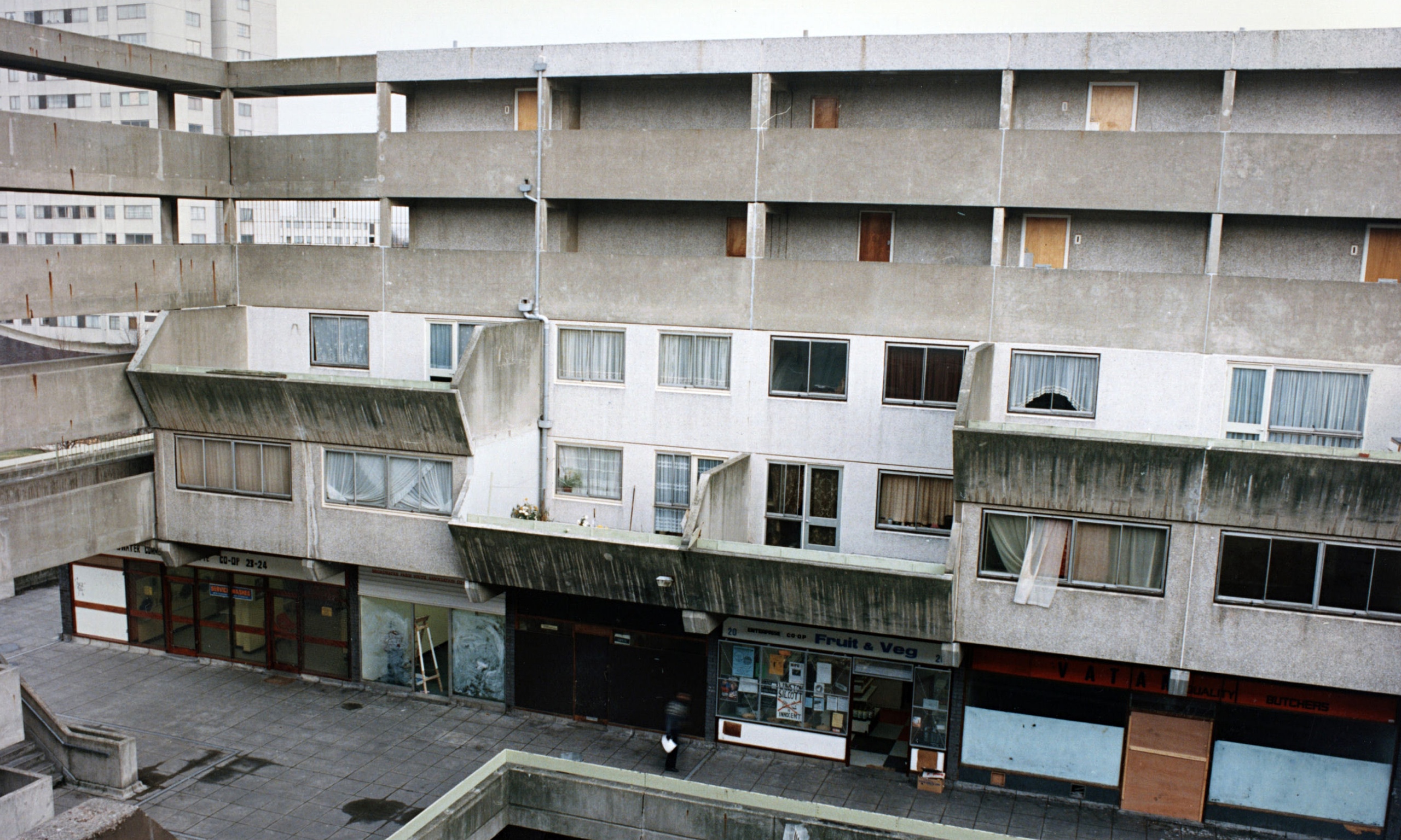
This is the picture I chose to use for my inside panel, as it is in Broadwater Farm estate and also follows the grey colour scheme from our video and my front cover. This creates a sense of consistency throughout my anciliary products.
I then decreased the size of the image to fit the template and put more focus on the centre of the picture.

I also decided to add a group biography, which I took from one of my earlier blog posts to enable our audience to connect with the artists on a deeper level. In addition to this, I included the quote that was shown at the end of our music video to increase the level of synergy in my products. Bearing this in mind, I also utilised the same technique of using black rectangles to make my text clearer for the audience and maintaining a black and white colour scheme.

Finally, I created the CD space with the ellipses tool and reduced the opacity so the image in the background can still be seen. This also replicates the eroding effect that is evident in the image and is even further reinforced my my font. 

No comments:

Post a Comment