Showing posts with label Eray Kara. Show all posts
Showing posts with label Eray Kara. Show all posts
Friday, 23 January 2015
Final progress review blog and Final blogging task.
My blogs during my A2 are in much more detail in contrast to my AS Blog. Reason being with the experience i gained during my AS year, my outcome on research methods and use of different variety of programs were a success. Platforms such as camtasia and final cut pro enabled me to gain more understanding in video editing. My research conducted and how i presented them using emaze, slide-share, powtoon etc, was more detailed and presentable.
Therefore my blogs are more effective due to my research and planning that was conveyed.
Despite using the main ICT recommended to us, i still believe using more variety of ICT would certainly help me conduct a better research and planning in the future.
My A2 coursework was possibly the most enjoyable coursework i encountered. Given all these opportunities meant i had to produce a stunning music video which i put my full effort and time in. A lot of time and preparation was included within this coursework. So i'd like to say a huge thank you to group 26 and the whole of set 6 for spending some of their precious time giving feedback. I want to close this blog off by letting you watch the purpose of this whole coursework.
Thank you.
26. Youssof, Tyler, Eray from 283goswell on Vimeo.

Wednesday, 21 January 2015
Introduction to 'Ancillary work'
As our music video has been completed, now its time to research on how we'll attract the audiences attention in order for them to buy it our product.
During class discussions, we looked at previous Digipak and advertisements that students created.
The importance of the functions the digipak and advertisement of the music industry. Below are 3 examples:
Student
Group 28's ancillary work certainly uses conventions. The location, filter and instrument are certainly seen in the music video itself. Once a member of the audience identify the Digipak, it wouldn't take them long to realise that the advertisement/digipak is from the music video if they're familiar with it.


Group 11 also uses conventions similar to group 28. The use of synergy within the music video and digipak/advertisements is essential. This gives the artist more recognition.

Initial ideas on evaluation
Evaluation question 3 initial ideas
How did you use media technologies in the construction and research, planning and evaluation stages?
HOW i used technology. This could conclude of twitter, Instagram and Facebook feedback. I will discuss how i reached my target audience with my music video and digipak/advertisement.
I will then discuss the programmes that i've used such as photoshop, Final cut pro Etc.
Evaluation question 4 initial ideas
With evaluation 4, I will include both visual video feedback and written through messages as it will show that I've used more than one platform in order to receive a more valid response/feedback.
Skills development
- During the process of the music video, the programmes that had been used was Final Cut pro. During the programme, as a group we were much more familiar with the use of effects, such as:
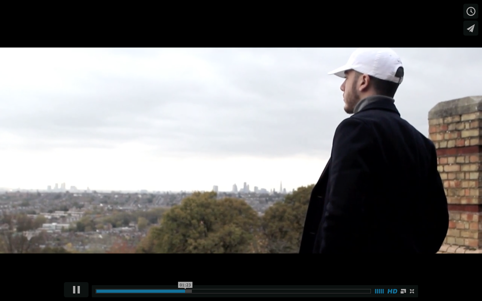
- Colour coding - putting a filter on with a lighter, dull, greyish feeling. Playing around with the colours at first enabled me to gain experience and awareness of how to make a video look "movie-like" and "music-like"

- Video transitions - with variety of video transitions to choose from, this gave us a better flow through videos during the intro and outro
- Widescreen - the use of widescreen enabled us to reason the outcome of a more professional music video as we get to see these widescreen effects during movies and music videos etc.

With the help of these effects and my Canon 60D, we had an high definition (HD) music video. As a result once the effects were put in, we then received a low budget music video which looked like thousands were spent on.
Sunday, 18 January 2015
Editing the inside right panel CD.
For the panel covering the CD as well, using the leading artists image to give him more recognition. The artists photo from the photoshoot consisted of me applying a filter, adjusting the colour for it to colour code to make it look similar to the other 3 panels.


Friday, 16 January 2015

CHANGE OF PLAN - CD COVER BACK
 Back of the CD cover. The filter and past history of 1985 riots in Broadwater Farm estate. This gives a sense of history and better understanding of the artists habitat and region. The struggle of a working class man from a high crime rate estate. The blood, sweat and tears he went through to get where he is today. Always discriminated due to his background of family, he finds a legal way to reach success and help himself to get out of the 'ghetto'.
 The filter above suits the front of the album cover.

Advertisement
This is a artist from London who's also being advertised on YouTube at the end of his music videos. After this example, i also want to do this as an image alongside the advertisement of poster and Digipak.

Also, successful artist like Wale and Rick Ross are also advertised online too. not only on posters.


The back of the CD digipak

This image would be for the back of the Digipak. Another overview clearly showing the two tall buildings in the background which constantly appears in the music video. Text over this image would clearly show as there isn't much darkness for the text to blend in. The font colour would be white or black. Possibly black with a white background to it.
Images
 I'm more likely to use two different but corresponding images. For the front cover would be the overview of the entrance into Broadwater Farm. This then relates as the front cover is the main overview of the whole thing that is inside the CD pack. Therefore, this front image would be perfect as the filter also reflects back to the music video and location.
Images for the front (Idea 1)

This image could be used for the back of the cover and front. The image would be cropped in half and put on either side. This shot reveals a gang of police officers having Broadwater farm estate blocks behind them in the image. This image reveals a sense of lack of safety and increased fear within reputation.
Thursday, 15 January 2015

Subscribe to:
Posts (Atom)