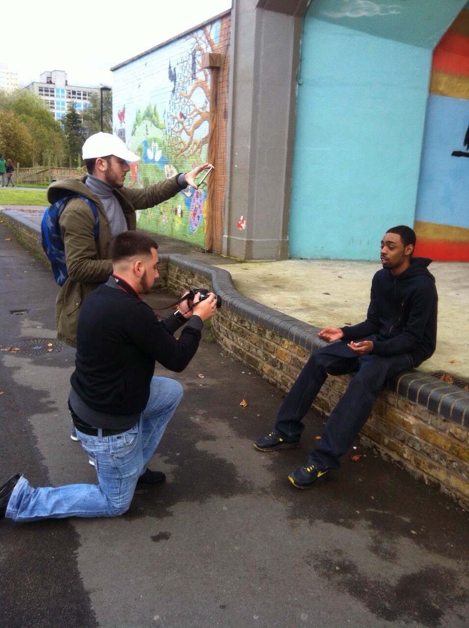
today we shot in our first location for our artist blazer , we had several establishig shots in the park and of the estate, this set the raw urban theme, it was a cloudy and windy day which was perfect for our filming conditions/theme.
we are on our way to film in our first location, in broadwater farm estate and in lordship recreation park in north london, which will see our artist blazer, rap in
In our album cover we wanted to feature an effective VCR effect which shows how raw our album /songs aim to be, and that our work was independent and made from scratch, so in order to achieve this look i added some grainy filters and duplicated a few images of me wearing a cap and shifted them about whilst changing their colours to red/green/cyan, this gave the 'ghost' affect you get from old vcr cams and vhs tapes, finally i used a vcr font to make it seem as if the shot of me was taken by a vcr camera when in fact it was taken by a standard still camera. keeping with our motif (the cap) i made sure in both the front and back of the album cover my character was wearing a cap, the name of our group 'volume' is printed across my eyes this is effective as it is in the middle of the screen and it is somewhere unconventional (across my eyes) this stands out to the consumer which gives them the knowledge of who the album features/is made by. Finally , becuase our artist's songs are aimed at aspirers i added a 'brit awards winner' and 'independent music awards winner' logo on the back cover.
The music video for 'Don't Go There' by Giggs and B.O.B influenced some of my decisions in planning in terms of: mise en scene, editing and cinematography. An example of this is the grey filter that is used throughout the video which shows the raw nature of the environment that Giggs was raised in. This also applies to the theme of our chosen song and is therefore a valid option. I also noticed that the grey filter emphasises the colour white (1:28 - 1:32). We could utilise this as our main artist's motif is a white cap, which means that we can give more attention to it without having to use much close ups. An aspect of cinematography that I liked was the tracking shots that show Giggs walking through certain areas while rapping. This created a sense of him bringing the viewer with him on his journey, thus allowing them to further connect with him and his lyrics. We will use this in Chipmunk(Blazer)'s verse when he says 'Let's take a walk through the North'. Mise en scene such as the dark costumes that Giggs and others wear are another factor that I took interest in due to the compatibility with the grey filter. Again Blazer will make use of this by wearing a dark hoody to show his roots and appeal to our audience visually.
'Ill Manors' by Plan B is another video that influenced my final production. The location and actors in the video appealed to me as it was an estate full of youths, which highlighted the grittiness of life in poorer areas. We plan to use this location to film Blazer's part as he is reflecting on life as an adolescent in London, however, we won't be including other young people as we don't want to brand our group in a negative light. The establishing shot of the estate also struck me as it illustrated the immensity of the building. We will use this method by making the estate we film on, Broadwater Farm Estate, look immense by filming shots of it from various angles to make it look big. Finally, the editing used when Plan B done a throwing gesture at the camera followed by the jump cut to an MP getting an egg thrown at him caught my attention (1:08 - 1:13). This is because our group could use similar cuts to show the transitions from verse to chorus in our video, which is aesthetically appealing.
The last video that influenced my final planning decisions was 'Hometown' by DVS. From the outset of the video, the array of various establishing shots of both people and buildings gave me a complete idea of the environment that he comes from and set the scene for the rest of the video. We will utilise this by implementing a similar style of filming in the different locations that we film in to help us in establishing the settings we use. The shots they got from filming on the bus also interested me as it provided us with extra angles of Brixton at the same time as showing us how he used to travel. We can integrate this into our own video to provide our audience with more angles of our settings or even use it to show the changes in location as different artists perform. I also thought that the slow motion used to show people getting on with their everyday lives was good as helps to establish what life is like in the area. We will use this method to show the contrast of people's lives as we change locations
The front cover of Maverick Sabre's first album, 'Lonely Are The Brave' features only two colours: black and white, which suggests that the songs will have a straightforward message. In addition to this, the album cover has a picture of him with a shadow covering half of his face, which implies that there are two sides to him: light and dark. Furthermore, the fact that he is looking down with somber facial expression highlights the sad nature of the songs that feature in the album.
The back cover of the album features the same colours as the front which maintains the theme of the album. The fact that there is no picture of Maverick or title of the album on the main body of the cover also emphasises the artist's music instead of his identity, which suggests that he cares equally about his image and music.
This advertisement for the album contains the major contents of both the front and back covers of the album to give the viewer as much information as possible using little space. The use of the same colours as the album also cements his branding as an artist with a straightforward message. Detials such as his website address and the release date of the album also provides his audience with a bigger scope of information and prompts them to inquire further into the album.
Our main artist, Maverick Sabre's, website promotes him and his music in various ways. One way this is evident is the use of black and white colours that feature on the homepage. This reflects the colours of the costumes that he is often seen wearing in his songs, thus maintaining his branding and motive through his website. In addition to this, the website promotes his music as a video and information about his latest single 'Emotion' is featured at the centre of the page. Links to his social media outlets such as Facebook and Twitter are also situated under the video to help his fans connect with him through other means. This also gives them access to announcements from Maverick Sabre such as new songs or tour dates before they are featured on his website.




.jpg)


